Selected work

Systems behind the assets.

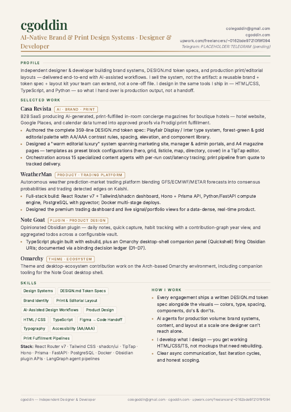
One live product case study and a set of print and social pieces — every one of them produced from a written token spec rather than one-off decisions.

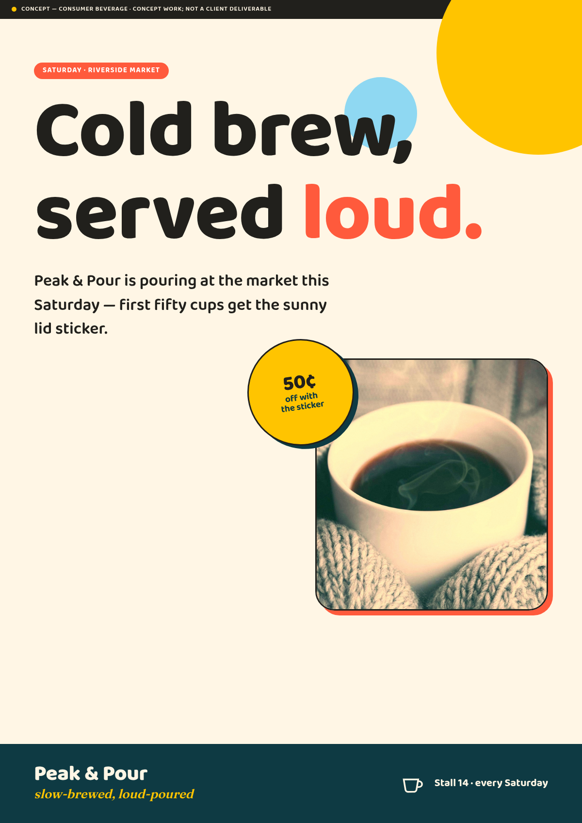
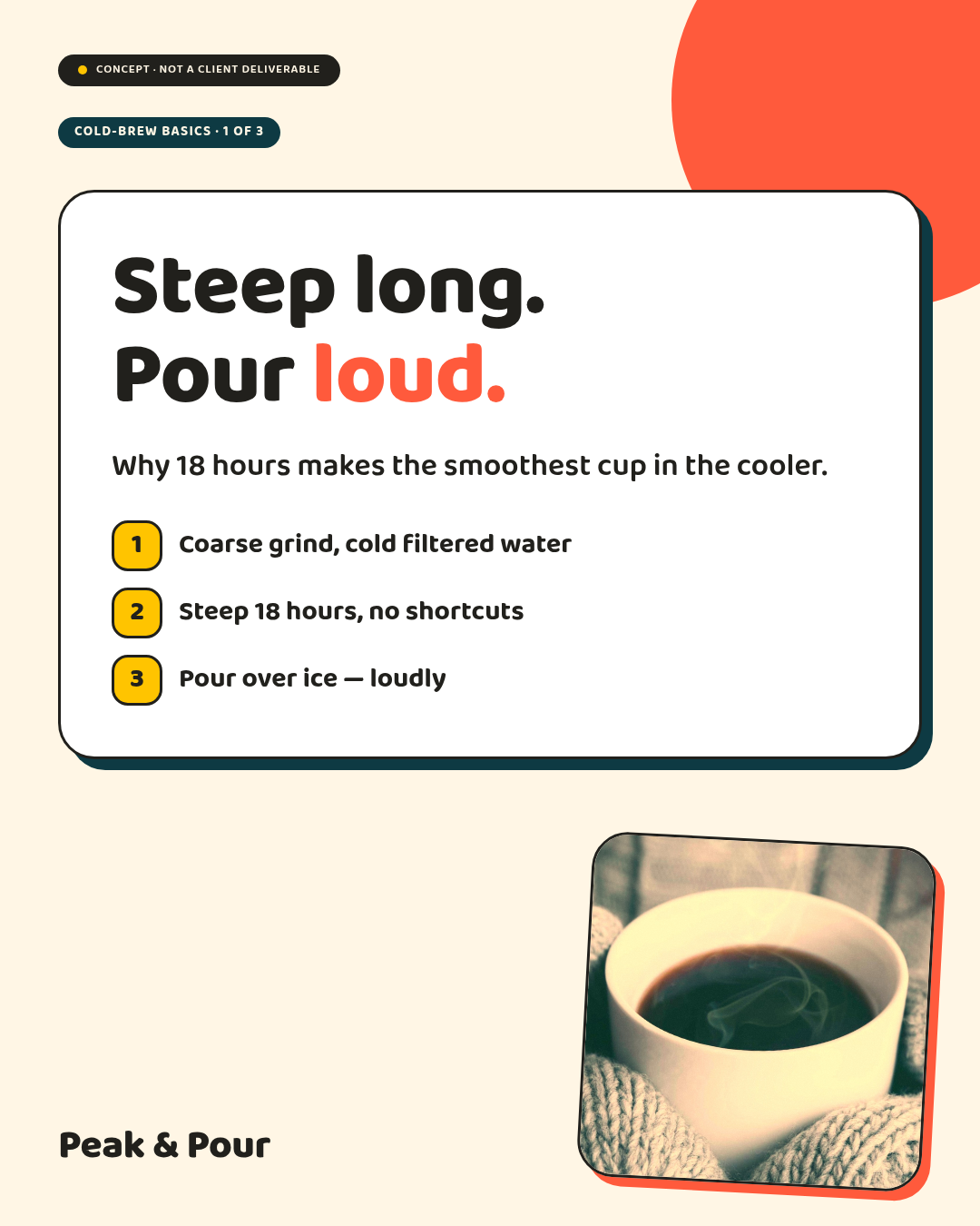
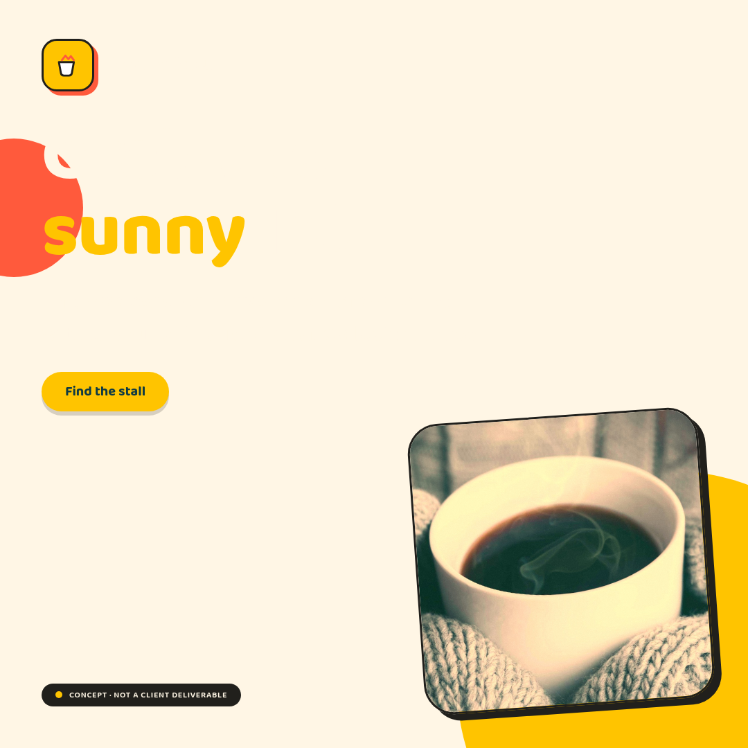
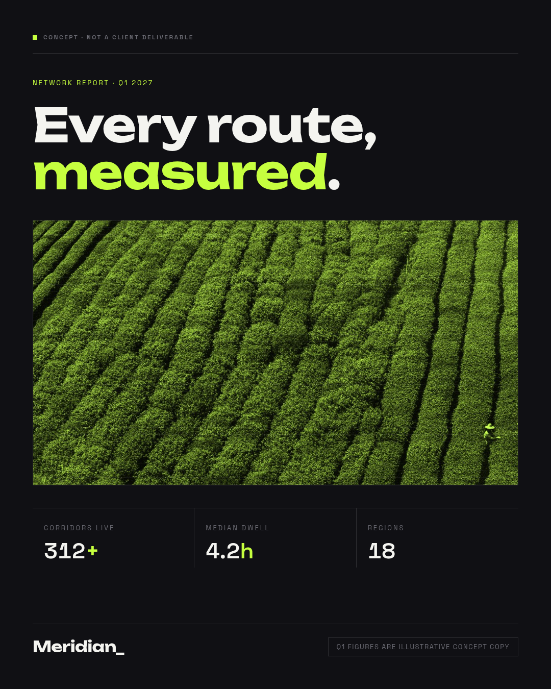
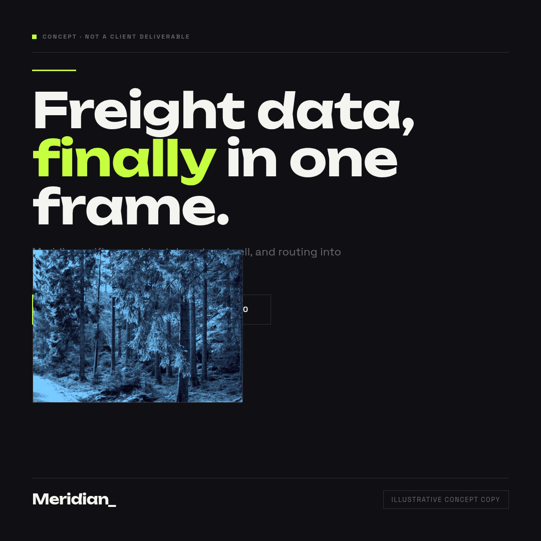
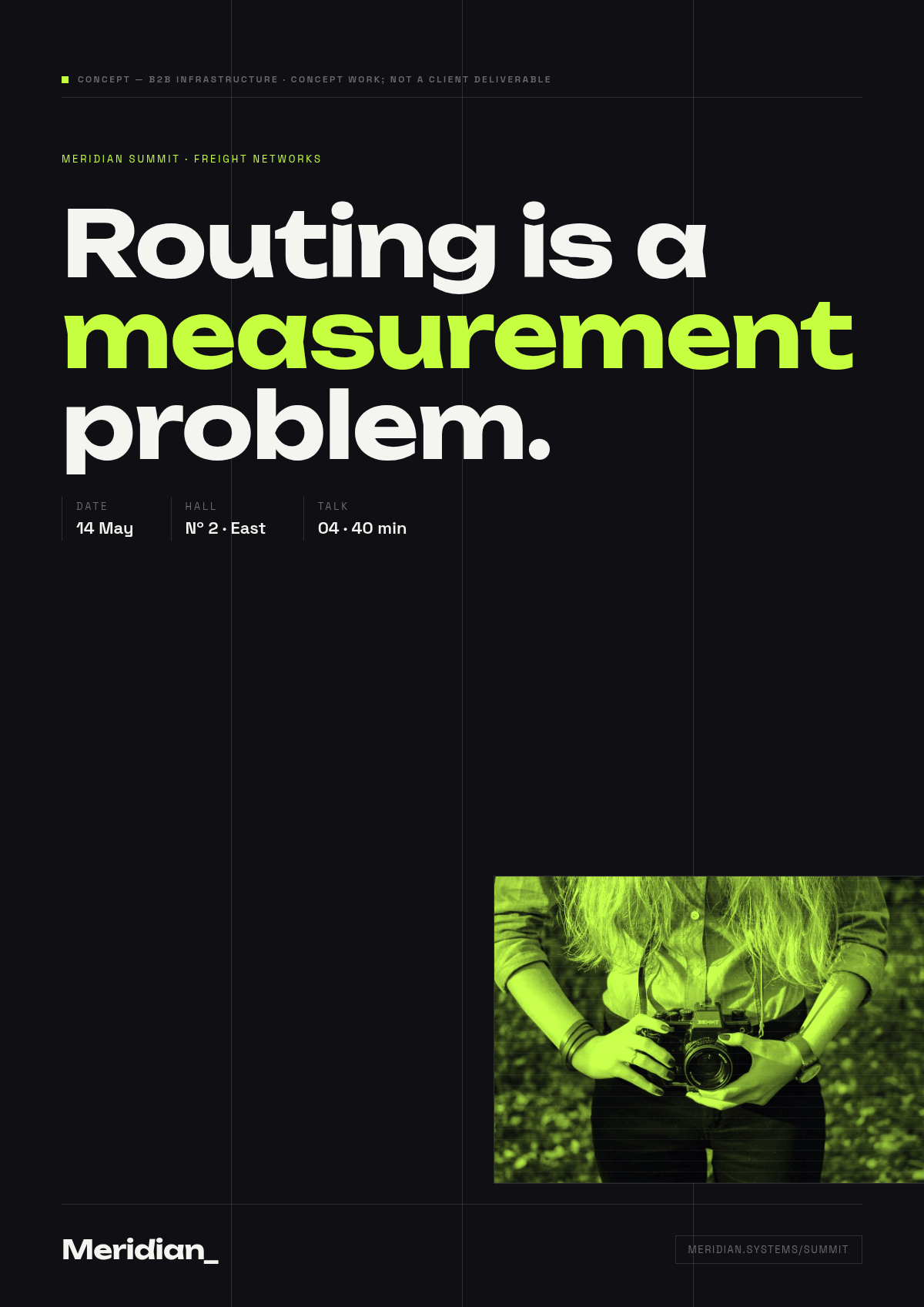
Three design voices Peak & Pour — playful illustrative consumer system: sunshine yellow, coral, teal. Meridian Systems — bold editorial-minimal infrastructure system: near-black, electric chartreuse. Halcyon Grove School — warm editorial system: forest green, cream, gold.
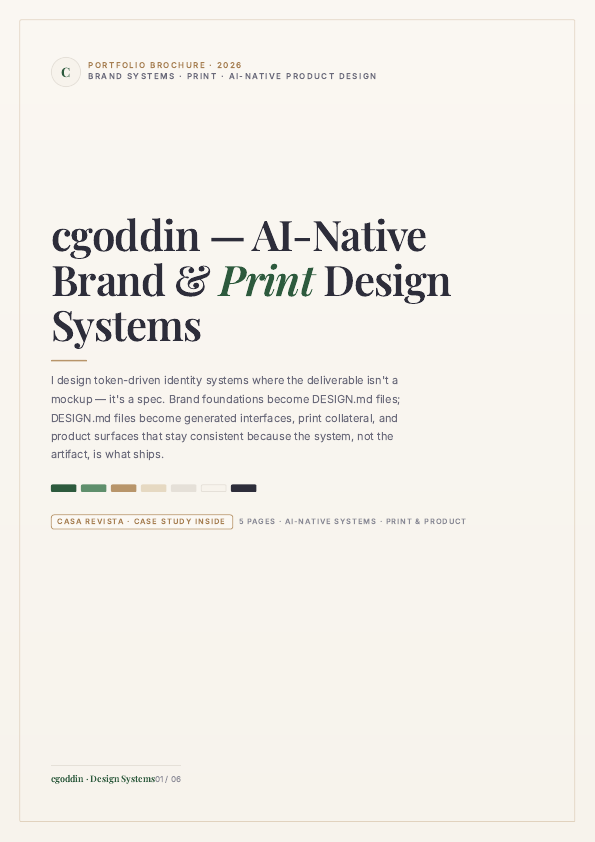
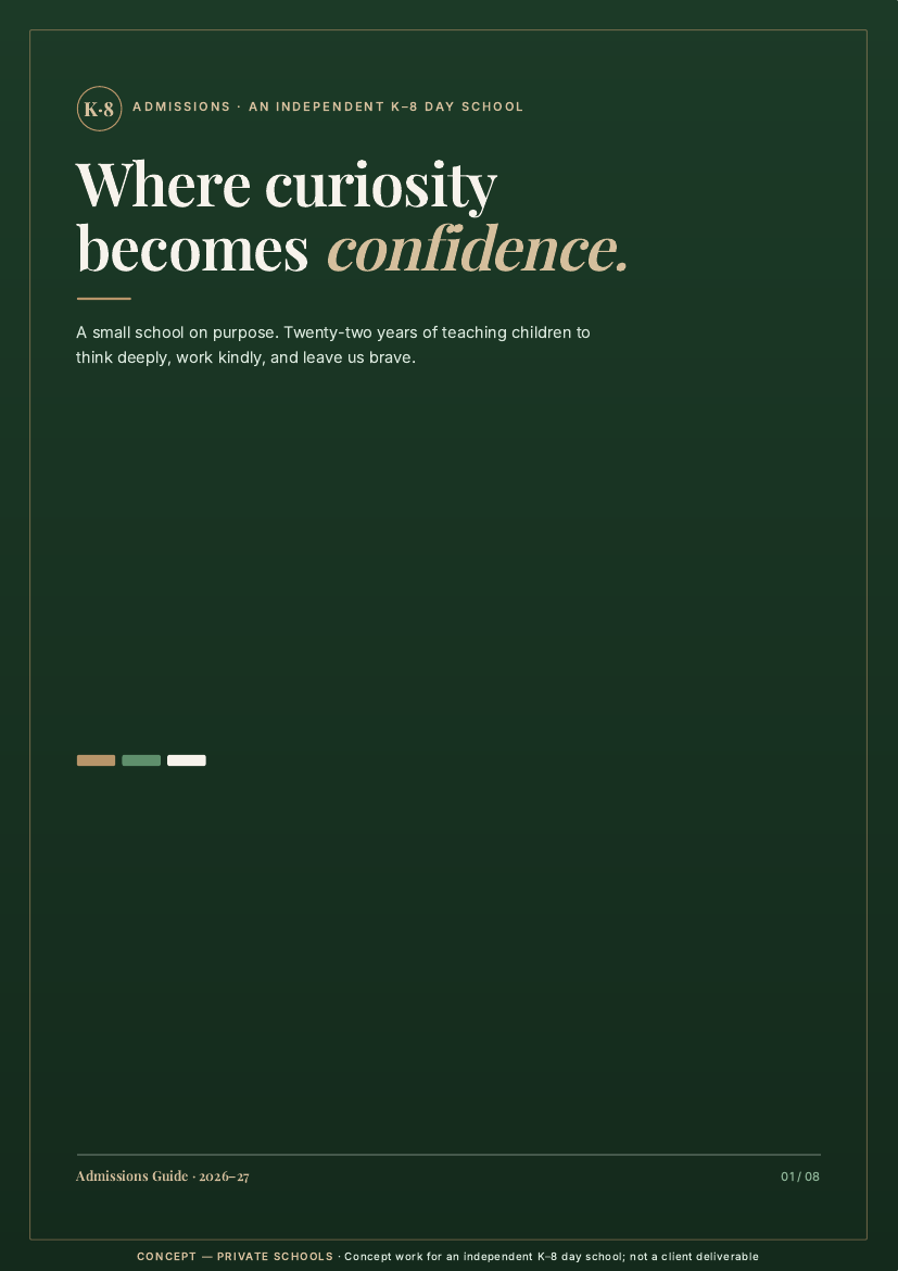
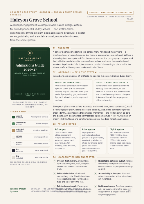
Halcyon Grove School case study page: brochure cover component, token ramp, and the design-system write-up.

Case study · A4 · one page

Case study · Marquee

Halcyon Grove School — one written token spec behind a complete admissions design system

A concept engagement for an independent K–8 day school: a brochure here, an open-house poster there, seasonal ads and social posts — each piece drifting without a shared system. One written spec puts every asset back on-brand by construction.

  • Authored the token spec — six 10-shade colour ramps, a Playfair Display / Inter type system, 8px spacing grid, restrained 8px radii, elevation, and component recipes.
  • Wrote the rules down: do's and don'ts, documented contrast ratios (ink on canvas ≈ 14:1 AAA, green on cream ≈ 6.5:1 AA), and one sanctioned exception — the deep-forest cover pages.
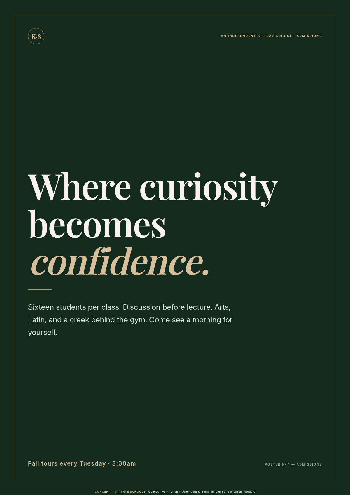
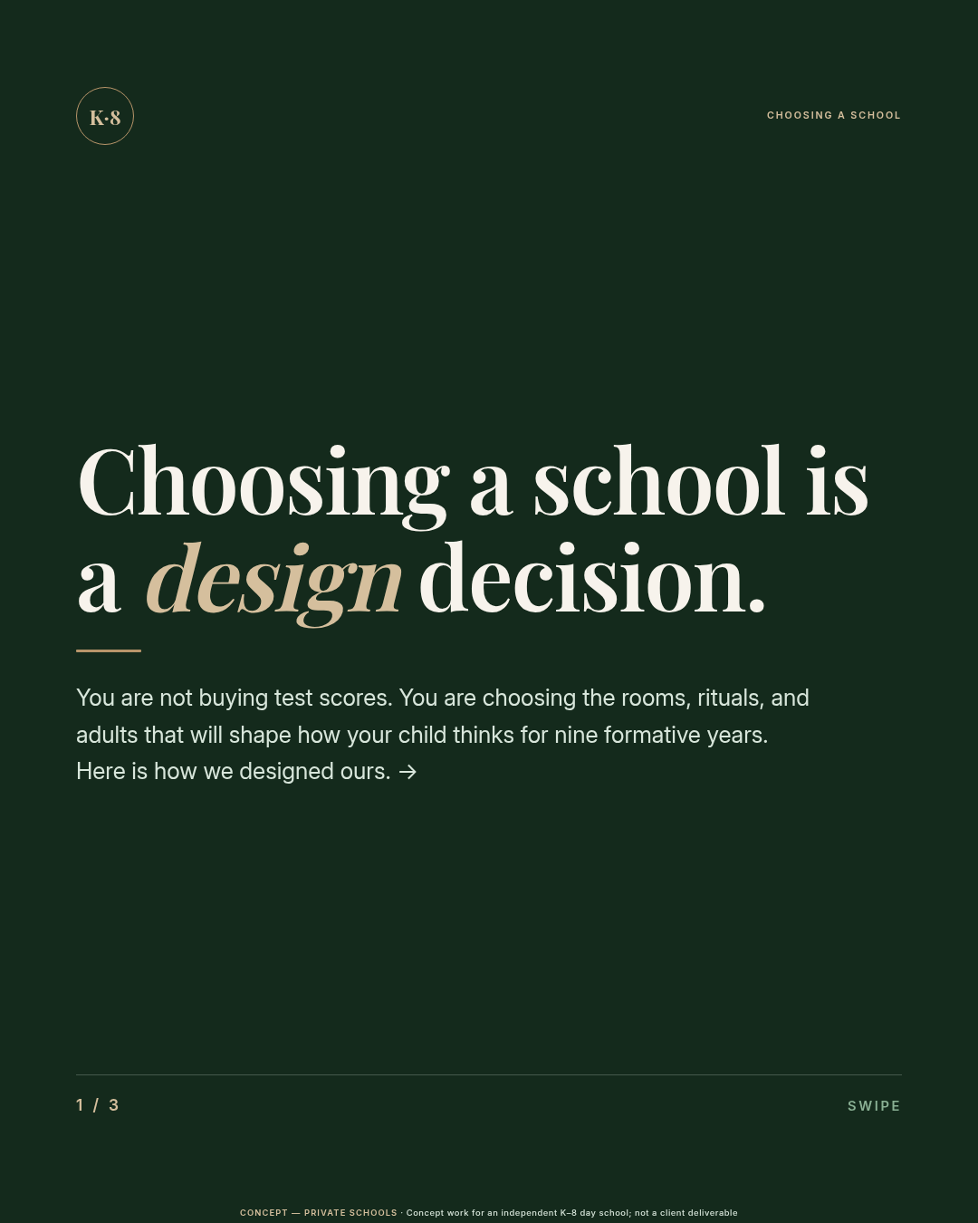
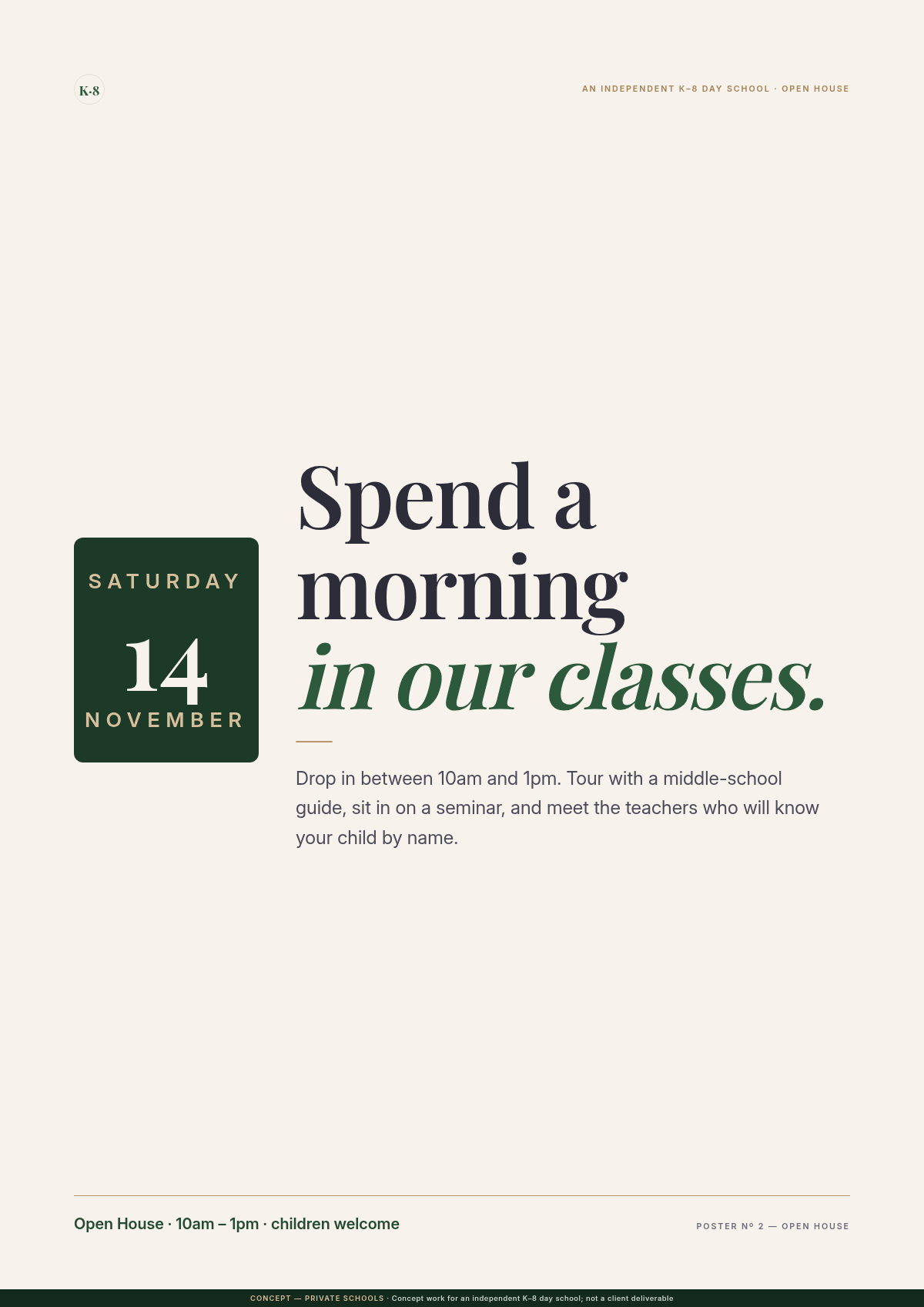
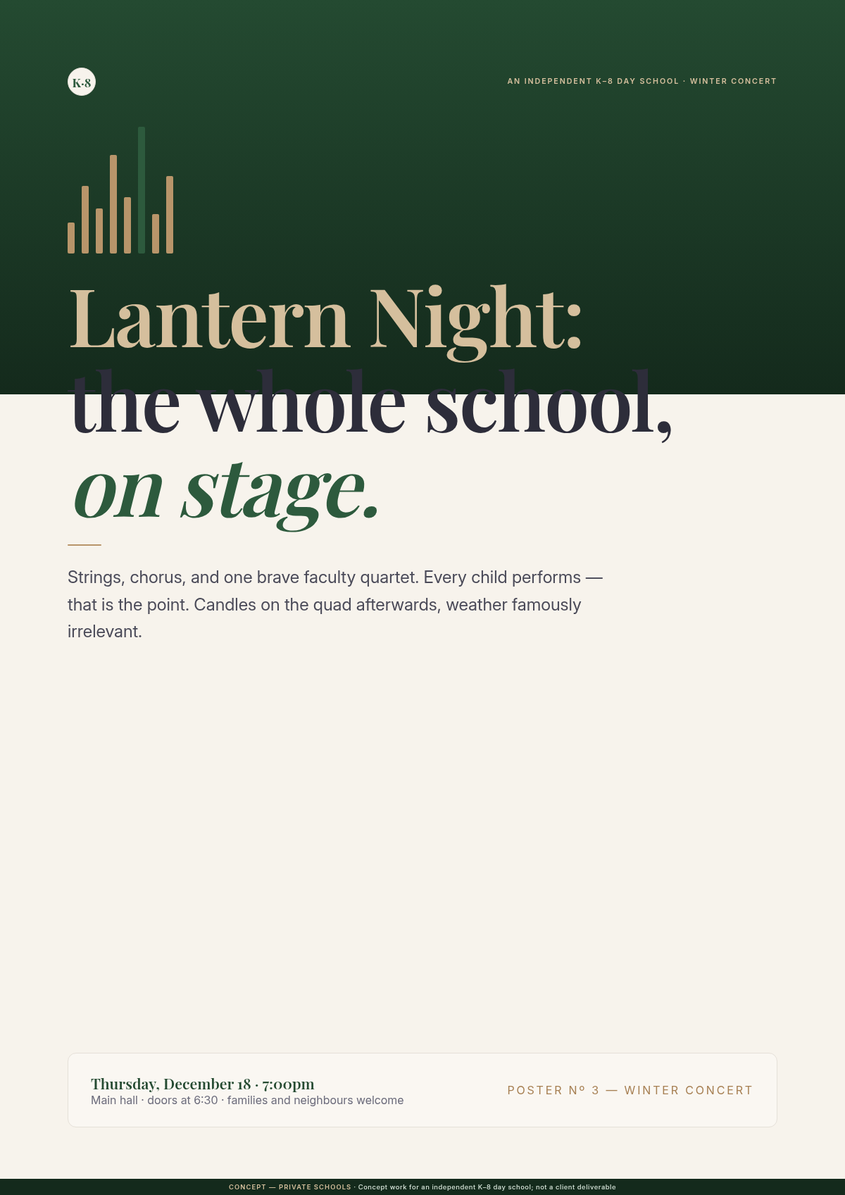
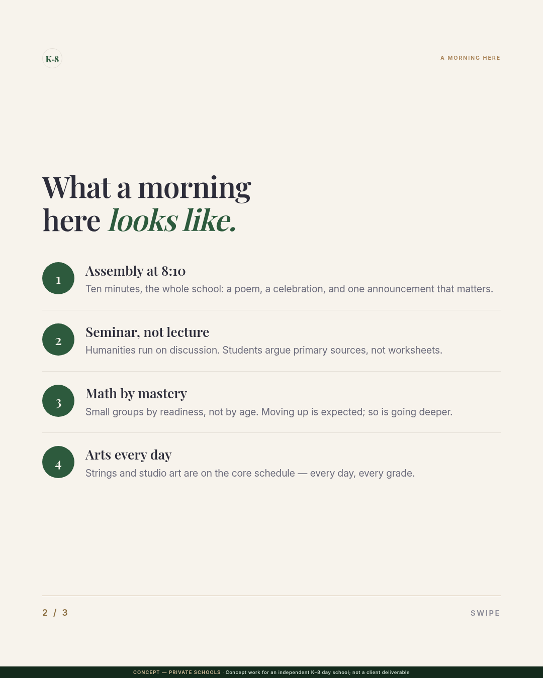
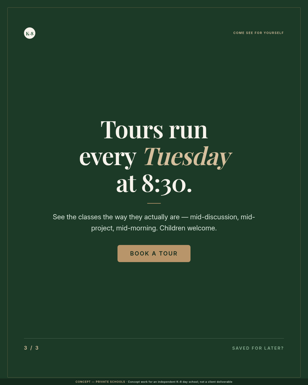
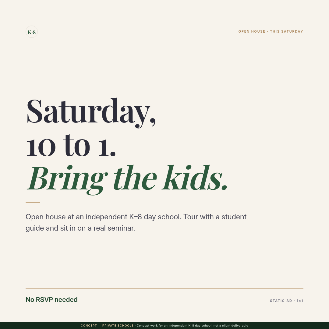
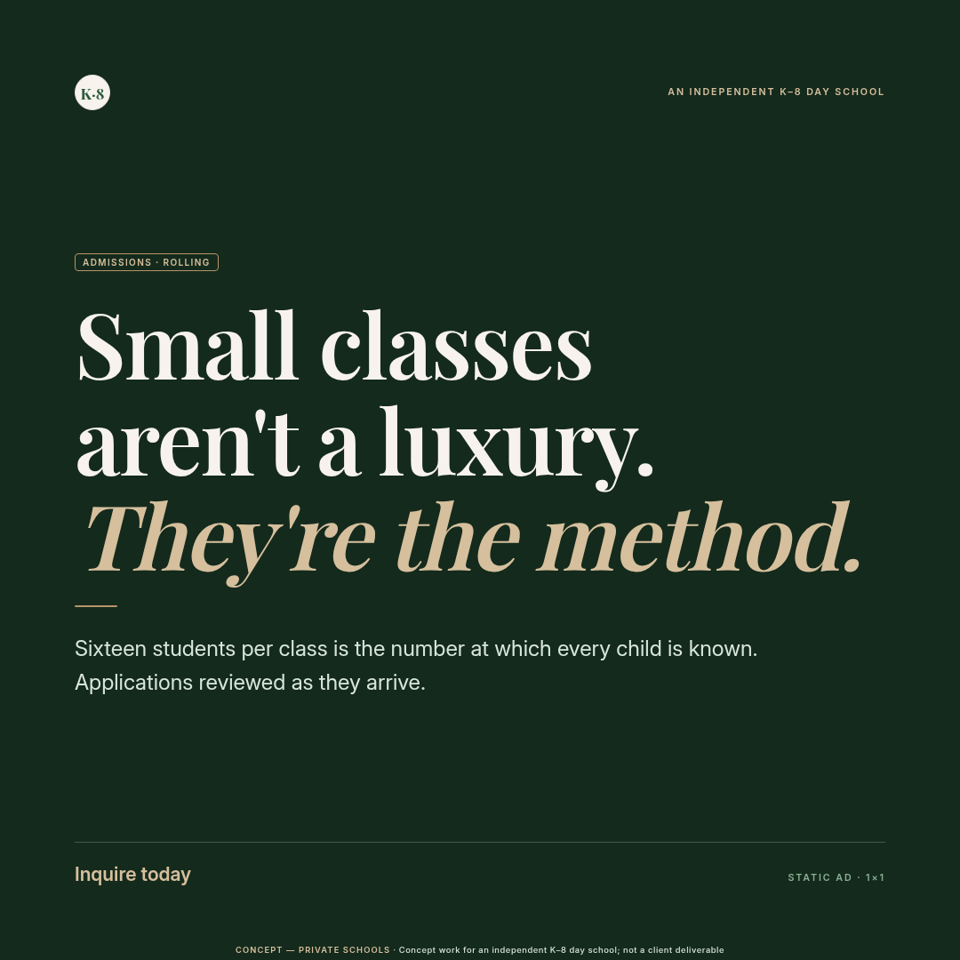
  • Rendered every asset from it: eight-page A4 admissions brochure, a two-poster admissions series, seasonal print ads, and a three-slide social carousel — one system, print-ready PDFs and digital exports.

Range · three distinct design voices

Not one look. Three design systems that sound nothing alike.

The studio spec (warm editorial) is voice one. Two labelled concept systems stretch the range: a playful illustrative consumer brand, and a bold editorial-minimal infrastructure brand — each with its own token spec, icon set, image treatment, and rendered assets.

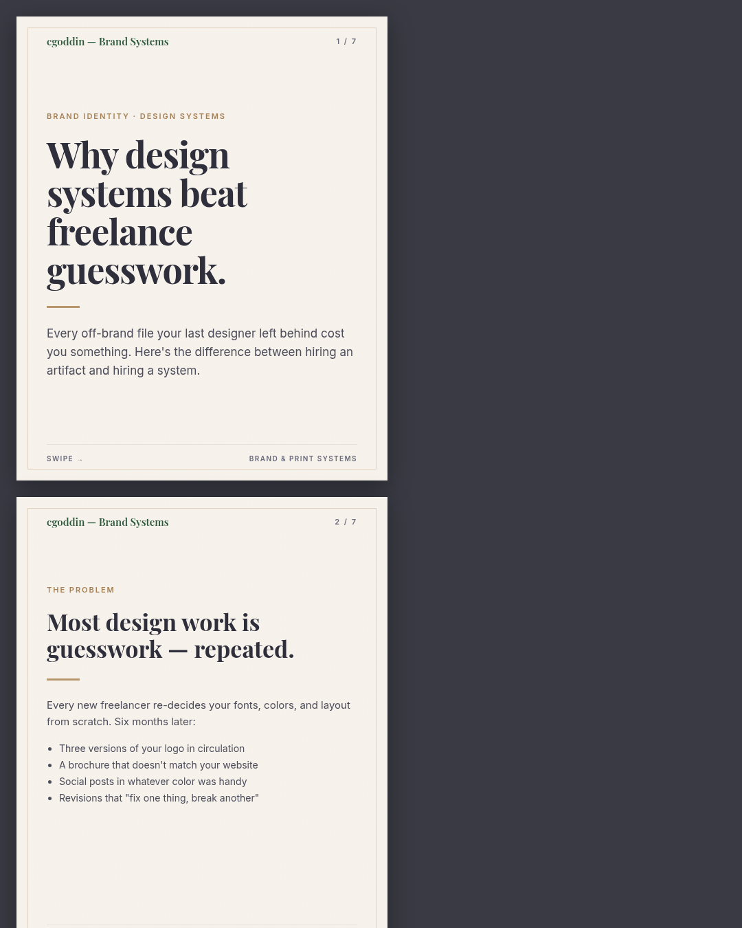
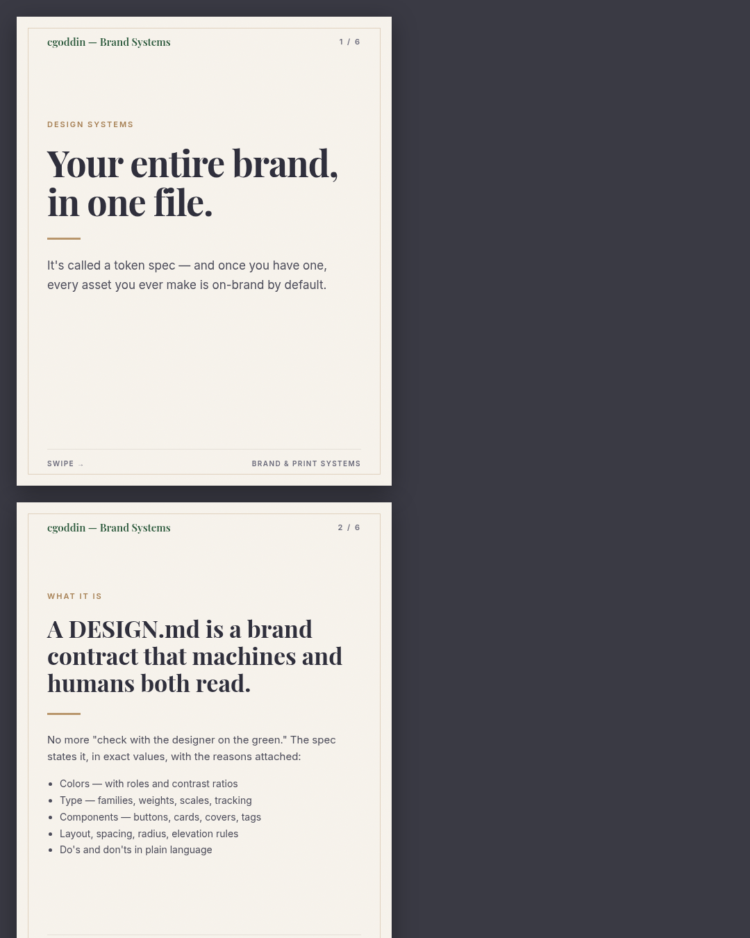
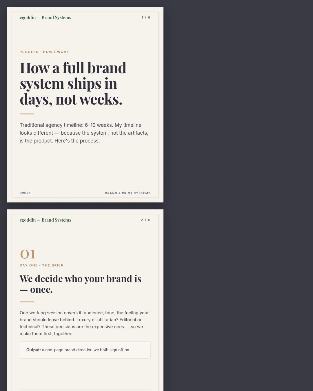
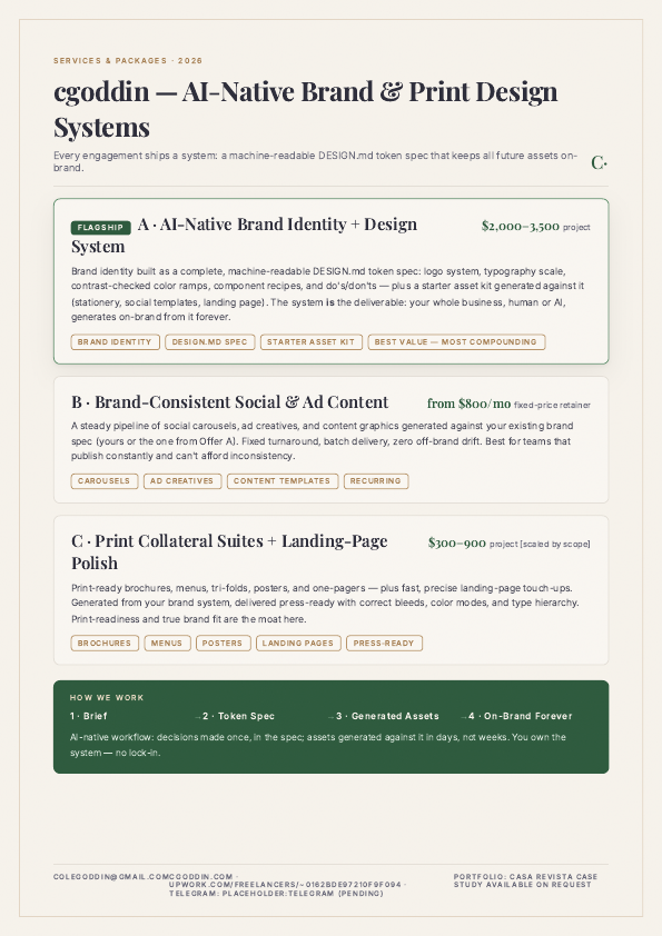
Print & social pieces

Brochures, posters, carousels — the everyday deliverables.

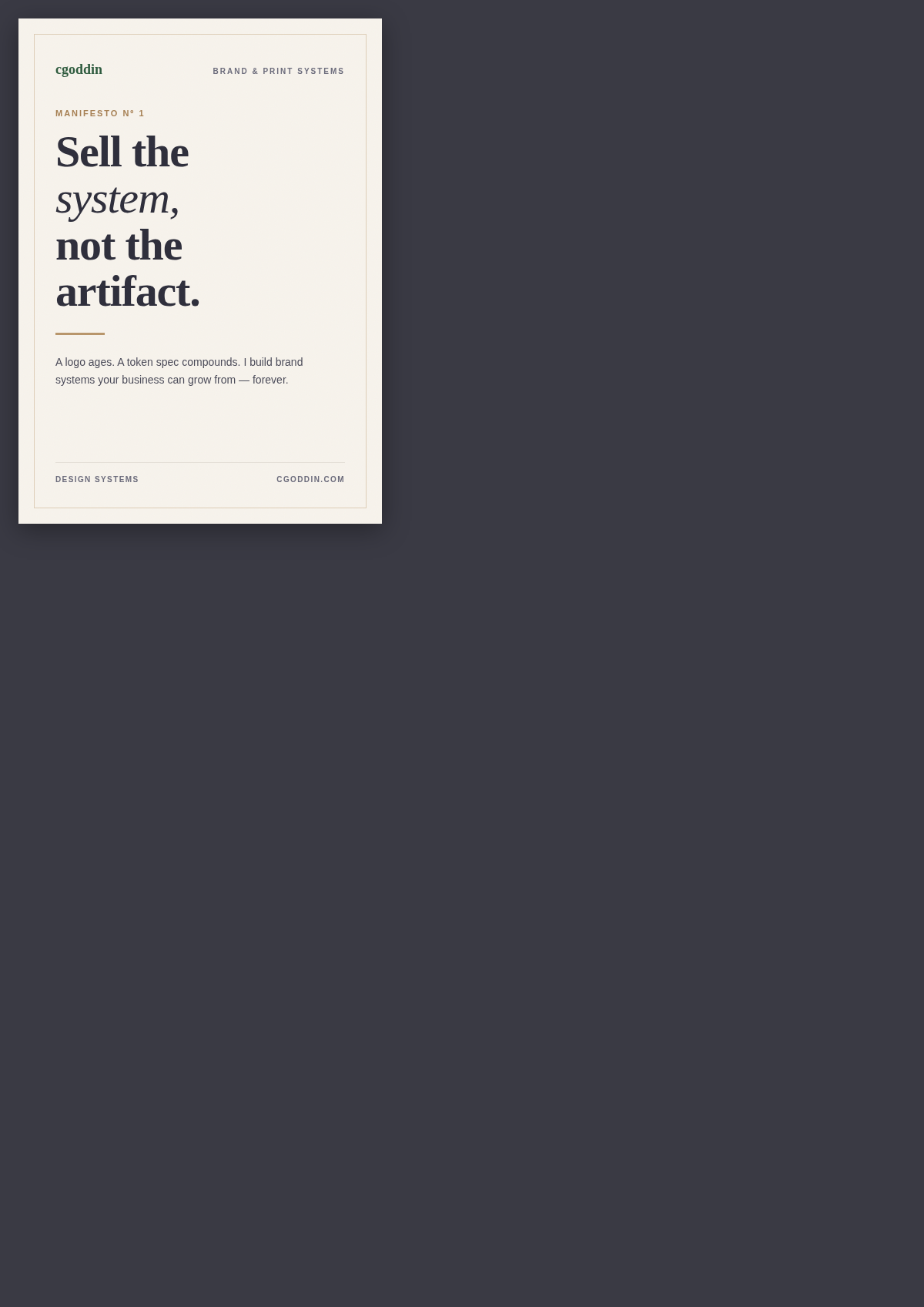
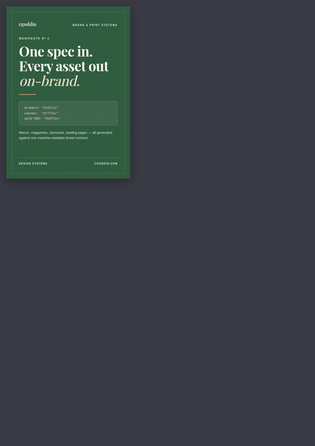
Each piece below was produced against a brand token system, so it reads as part of the same family rather than a standalone design.

Concepts gallery

Work in your vertical — labelled as concept, built like client work.

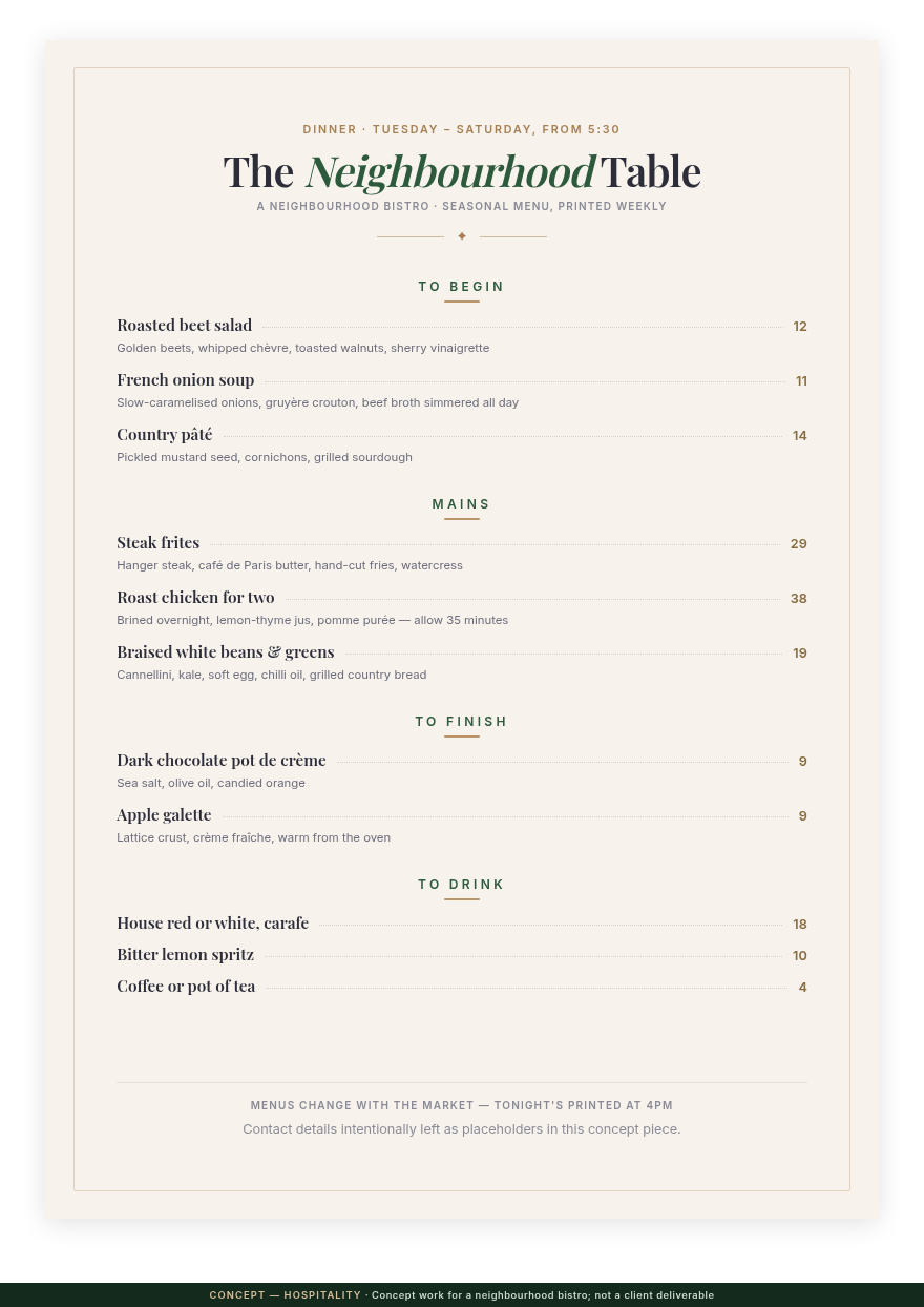
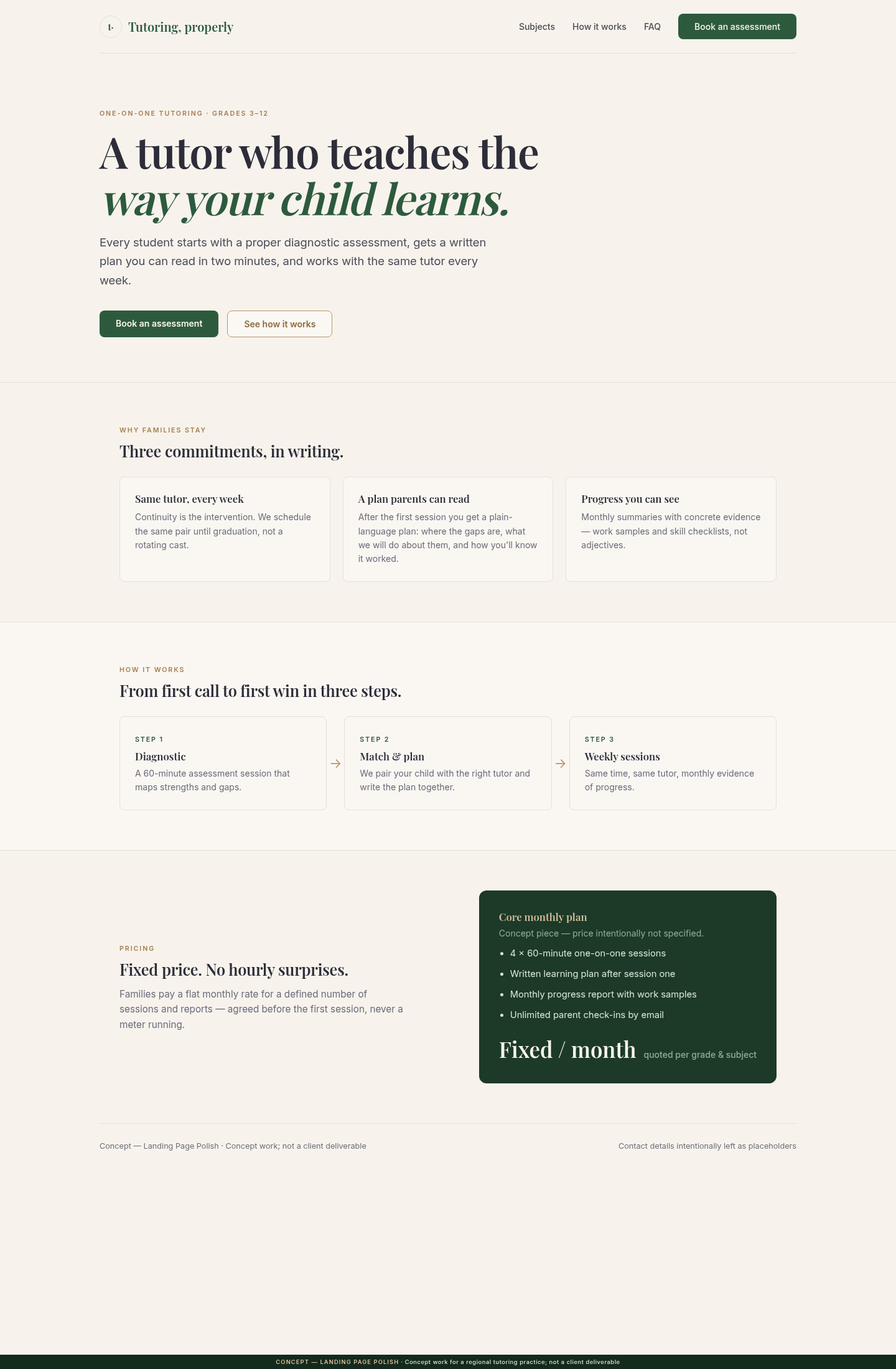
Every piece below is concept work for our entry verticals — private-school print, event posters, social content, menus, and landing pages. Each one is labelled Concept honestly, and they all render from the studio's warm-editorial token system (the case study above). For deliberately different voices, see the range section — two further systems in their own tokens, icons, and image treatments.

All pieces above are concept work: no client names, no real organisations, no invented results — each render carries its own concept label.
Next

Your brochure, your posters, your feed — one system.

Describe the deliverable you need this term and get a fixed price back.