Concept identity system · 03
Meridian_
Systems
A bold editorial-minimal identity for a fictional logistics-data platform — near-black canvas, hairline structure, one electric accent, duotone photography. Deliberately opposite in voice to both the studio's warm-editorial and playful systems.

01 · Brief & direction
Concept brief
Client (fictional): Meridian Systems, a logistics-data platform for freight networks.
Ask: an identity that reads as precision infrastructure — engineered, calm, and unmistakably technical across reports, event banners, and product one-pagers.
Design direction
Near-black canvas with hairline rules and a visible structural grid; one electric chartreuse accent used at ≤10% of any surface; expanded geometric display type; duotone photography mapped to the brand's two value poles — depth and movement.
02 · Logo mark
Rules. The mark is a quartered circle — the filled quadrant always points to the accent. On dark, the ring is paper and the quadrant is electric; on paper, the inverse. The mark never carries a gradient, a shadow, or a third colour.
Wordmark: Unbounded, tight, lowercase except the S in Systems is never capitalised together with Meridian in display lockups — see do/don't sheet in the spec.
03 · Palette & type
Four neutrals and one accent. Electric is capped at 10% of any surface — it marks data, never decoration. Contrast: electric on ink 13.9:1.
Display — expanded geometric, used at 2 sizes only: hero and section.
Everything else. Tabular figures for all data; uppercase +22% tracking for labels.
04 · Icon set — structural, 2px
Twelve 2px line icons. Squares, circles, and meridian curves only — nothing hand-drawn, nothing filled except the accent state. Same grid, same caps across the set.
05 · Image treatment — duotone to the brand poles
Depth pole: grayscale → cyan shadow map (#0A0A1A → #78C8FF), contrast 1.6. For capacity, scale, architecture.

Movement pole: grayscale → chartreuse (#0C0E0A → #C6FF3F). For routing, logistics, flow.
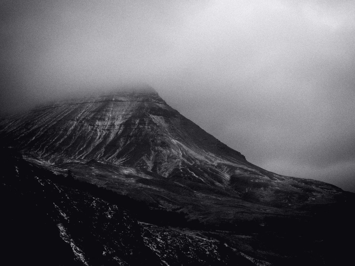
Neutral pole: grayscale → paper (#0C0C10 → #F0F0F4). For people, partners, reports. No full-colour photography anywhere in the system.
06 · Rendered assets
Event banner, report cover social slide, product one-pager promo.
Also exported as standalone PNGs (banner 1200×1697 · slide 1080×1350 · promo 1080×1080).
Meridian Systems is a fictional brand created as labelled concept work by cgoddin — design-portfolio v2, system 03 of 03. Not a client deliverable.