Peak &
Pour.
a cold-brew brand that refuses to be beige
A playful, sticker-book identity for an indie ready-to-drink cold brew — built on rounded everything, sunshine colour, hand-drawn icons, and photography pushed warm and punchy. Deliberately opposite in voice to the studio's editorial work.


01 · The brief
Concept brief
Client (fictional): Peak & Pour, an indie ready-to-drink cold-brew label selling at farmers' markets and corner stores.
Ask: a shelf-ready identity that feels handmade, fun, and worth grabbing in three seconds — cans, stickers, market posters, and a social feed that all come from one kit.
Design direction
Rounded geometry, sticker outlines and offset shadows; a loud three-colour ramp (sunshine / coral / teal) on warm cream; chunky display type with a soft-serif wink; iconography drawn as a family, not picked from a library; photography graded warm, high-saturation, with grain — every image treated through the same recipe.
02 · Logo mark
Rules. The mark is always a rounded tile with an offset sticker shadow — never flat, never on a sharp-cornered chip. The wordmark is Baloo ExtraBold, tight-tracked, with a full-stop period in coral.
Clear space = the height of the sun-tile's corner radius. Minimum size 32px.
03 · Palette & type
One loud triad on a warm cream canvas — cool teal keeps the sweetness in check. Contrast-checked: teal on cream 9.8:1, ink on sun 10.9:1.
04 · Icon set — drawn as one family
Eight line icons, 3px rounded strokes, a sun-tile or coral fill behind alternate tiles. Same corner radii, same stroke caps across the whole set.
05 · Image treatment — a recipe, not a vibe
Warm grade: +35% colour, +12% red, −12% blue, grain 10. Every photo runs through the same recipe so the feed stays one temperature.
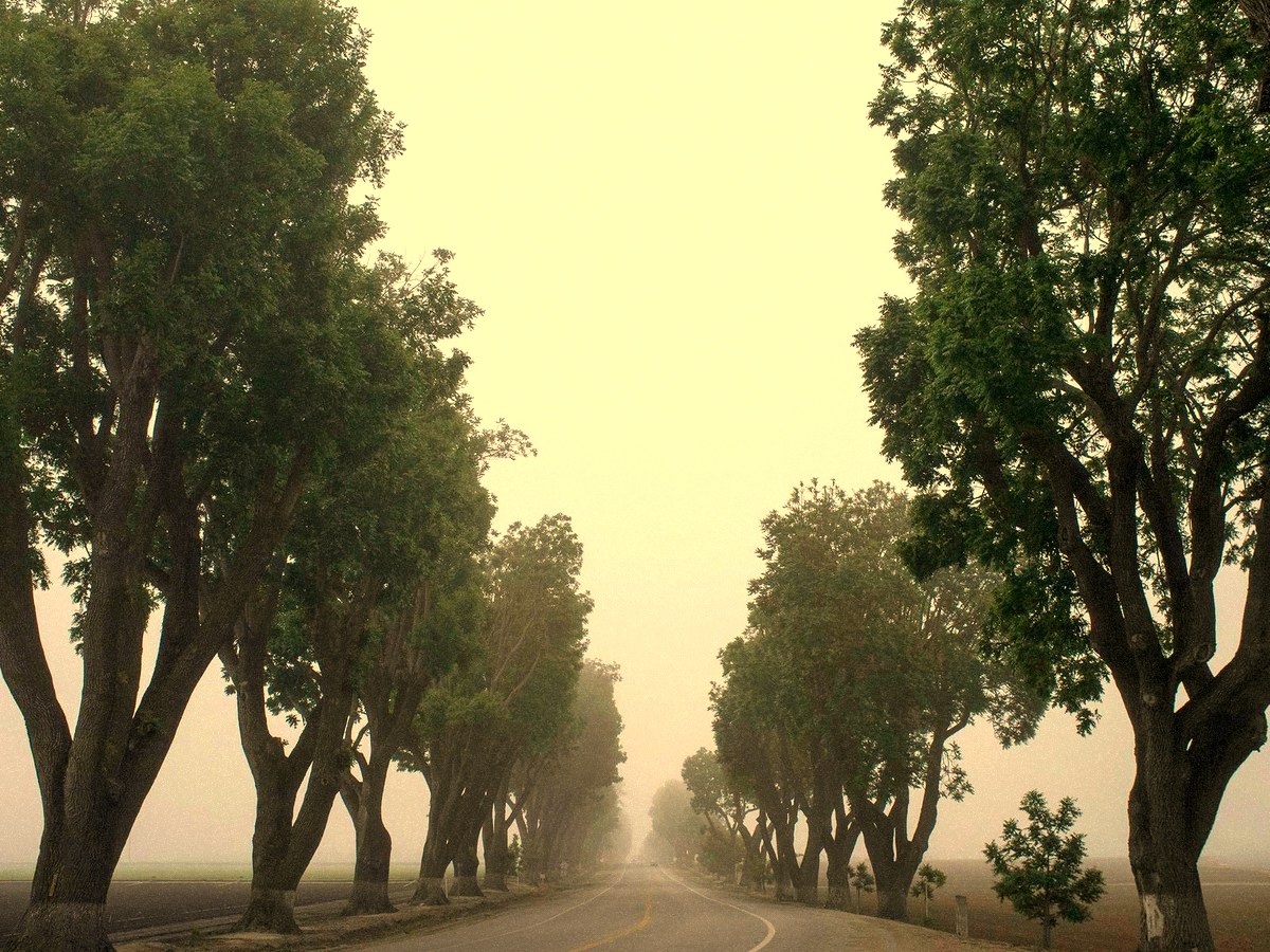
People & market days: faces and hands allowed, props chunky, daylight only. Half-tone coral dots sit on the frame corners in social layouts.
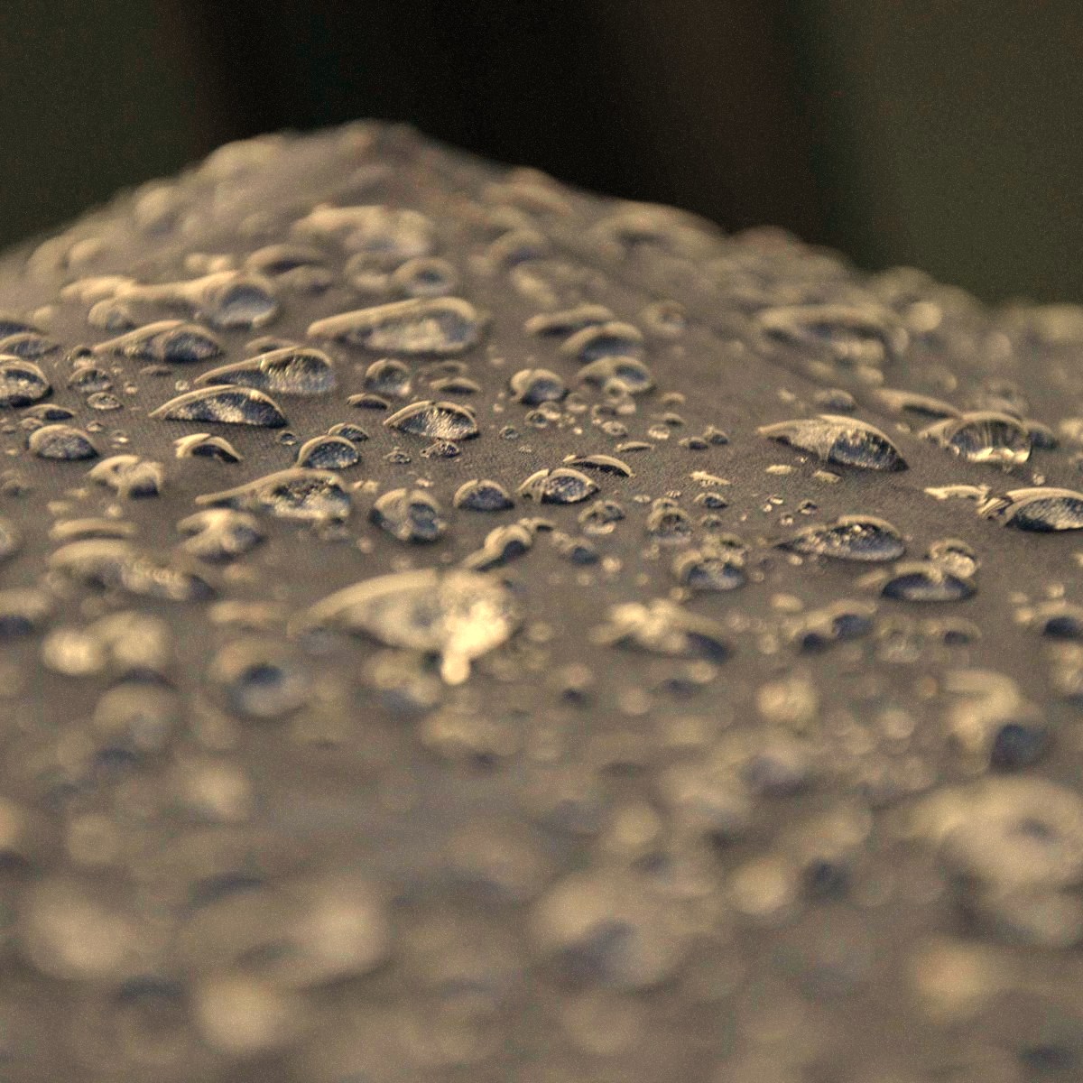
Textures: condensation, drips, frost — cropped square with the round sticker border. Used as backgrounds behind cans and offers.
06 · Rendered assets
Generated against the spec: market poster, social carousel slide, square promo.
Also exported as standalone PNGs (poster 1200×1697 · social 1080×1350 · promo 1080×1080).
Peak & Pour is a fictional brand created as labelled concept work by cgoddin — design-portfolio v2, system 02 of 03. Not a client deliverable.